🌷 Notes on "Larkspur"
a journey in layout design
Dear friends,
Welcome back to Saturn Peach! Today, for the second installment in our Inspiration theme, I’d like to tell you a little bit about a small collection I’ve been working on.
This collection is called Larkspur. In the language of flowers, the larkspur symbolizes playfulness; this collection is a little bouquet of games, rituals, and gatherings for solo and group play.
I’m imagining this volume as the first in a series. It contains five short games: Interplanetary Dinner Party, a new version of Dream Quilt, a new version of Colossal, and two brand new games! (Capybara Yuzu Bath and Strange But Not Strangers, if you’re curious.)
I’m really proud of how the games are coming together, and I think they’re a great representation of my first year or so as a designer! BUT.
I’ve been working on the layout for literally months. Getting these games to all look good together is driving me absolutely bananas. I’m not a trained graphic designer—I just know what I think looks good—and these games almost defeated me.
I put this collection down for a few months and just returned to it this week with fresh eyes—and I think I’ve solved it. So today, I want to walk you through my process so far.
Thanks for reading Saturn Peach! Subscribe for free to receive new posts and support my work.

Version 1: Spring Art (Small)
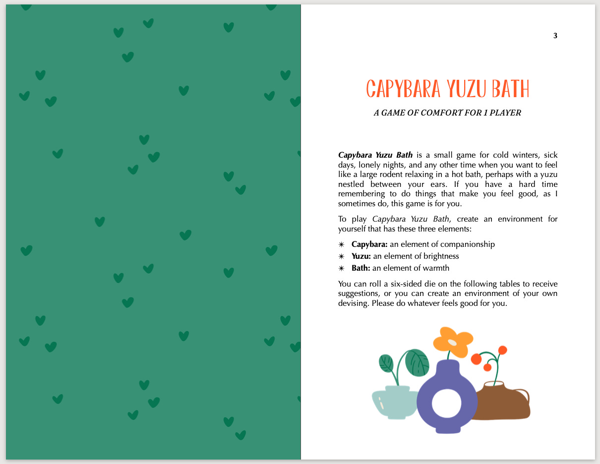
Once I collected up all my games, deposited them into a file, and gone through a first pass at editing, I tried to spruce up the pages a little bit. I chose a funky title typeface (Septima from Pretend Foundry), and combined it with a friendly sans-serif (Optima, one of my go-tos).
I found a “springtime” art pack on good ol’ Creative Market, and really liked the bright colors, natural motifs, and large number of options. I combined some elements to make this vase still life, added a pattern on the facing page, and picked out an accent color for the title.
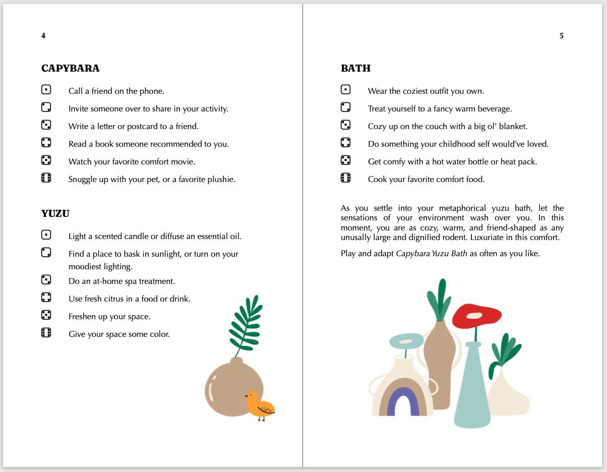
I liked the first page spread well enough, but as I kept going, I found that the art became too busy for the games. It didn’t really match any of them thematically, and it started to crowd up the pages. I had too much space to fill, and even with all the options, not enough to fill it with.
Version 2: Cozy Art
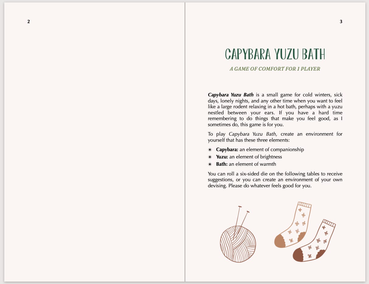
I tried a different approach with a different art pack: a “cozy” collection, featuring line-art images in different shades of brown. I adjusted the text colors, and made the pages a nice beige.
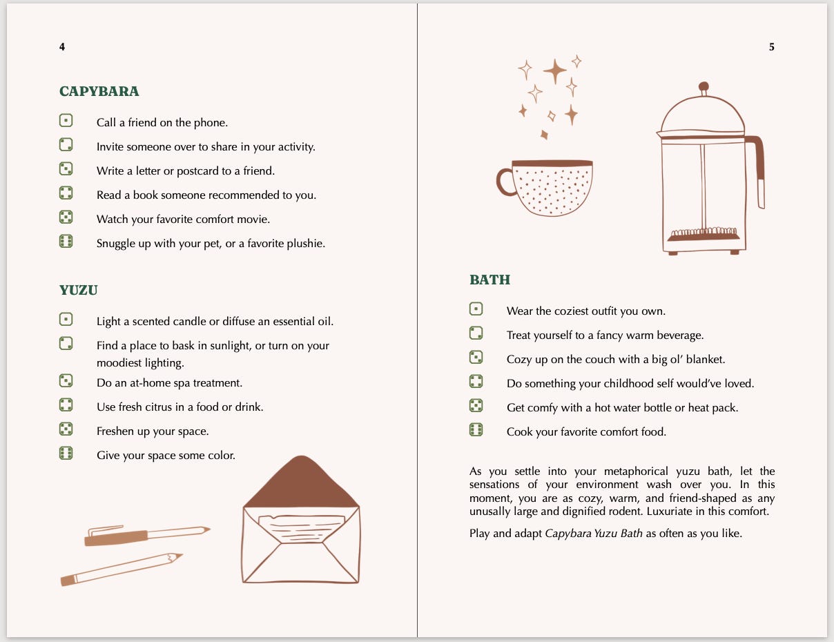
I felt like this art style gave me the same issue, and I liked it even less. The images fit at least a couple games thematically, but they now seemed too on the nose. I didn’t really like how the darker green headers and lighter green dice ended up looking.
I was also having some issues installing the different dice styles; I was looking for “rounded dice,” but ended up with “blocky dice.” This was a computer issue and not an issue with the typeface, thankfully. (Dicier is an extremely cool accessible and customizable typeface designed for games, and I’d recommend it for any game designers!)
Version 3: Spring Art (Big)
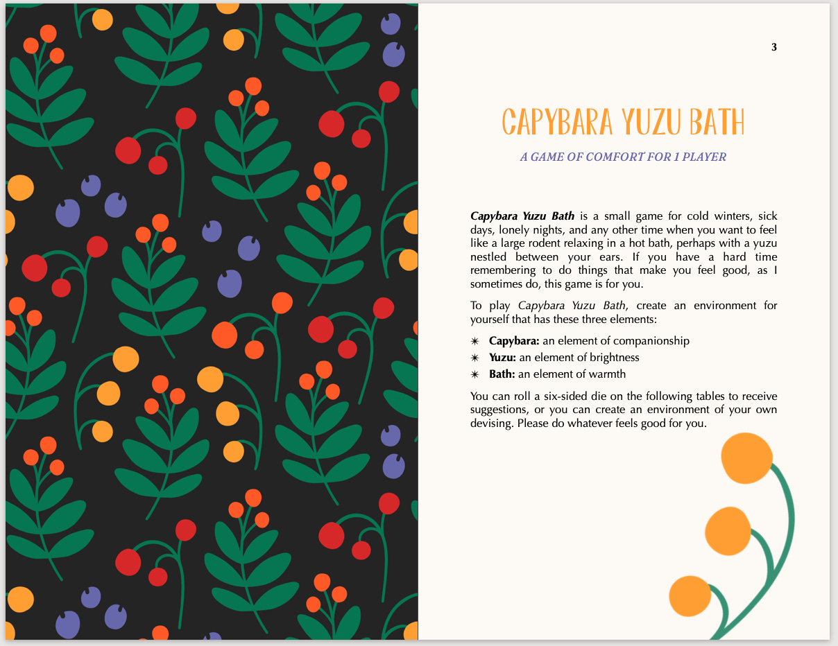
I went back to the first concept, but thought: what if I used less art to fill more space? I made the springtime BIG. I also made the pages more of a creamy color.
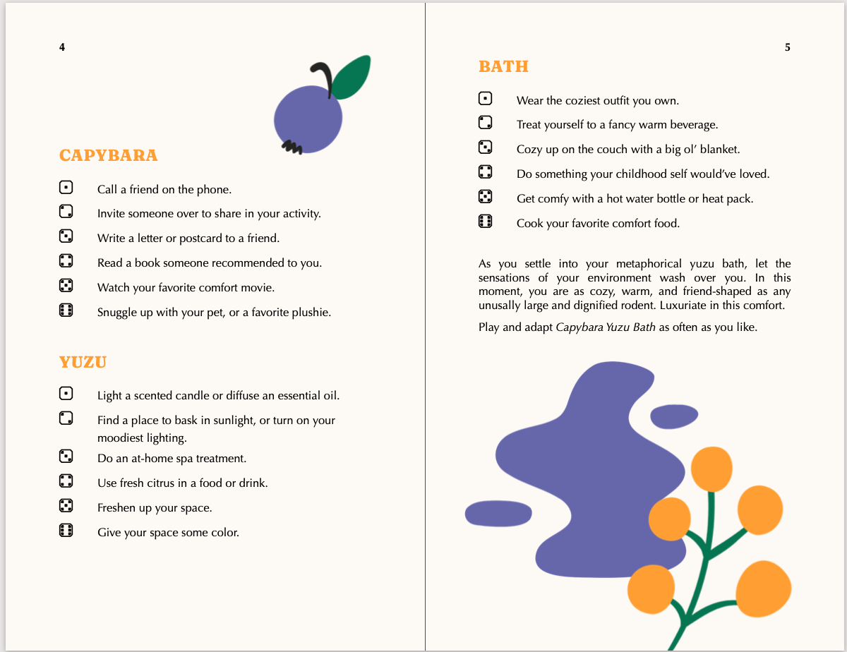
I actually was pretty into this version, and I got about halfway through the collection before I just ran out of steam. With the shorter games, I had an easier time filling up the space, but the longer games were still beyond my skill.
Version 4: No Art!
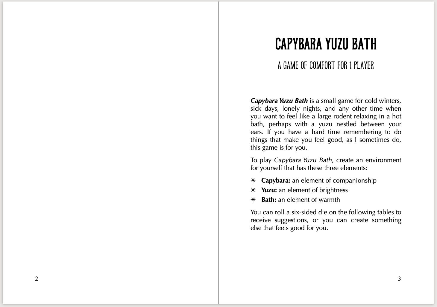
Larkspur sat in Version 3 for a few months, but when I opened the document again this past week, I had a realization: if I didn’t have enough stuff to fill up the pages, I could just make the pages smaller.

I had been making this collection so complicated when there’s nothing wrong with clean, simple layout. I chose a less-funky-but-still-fun typeface for the titles (ED Laurentsia), and kept the body text the same. I also finally figured out how to install the right dice icons!
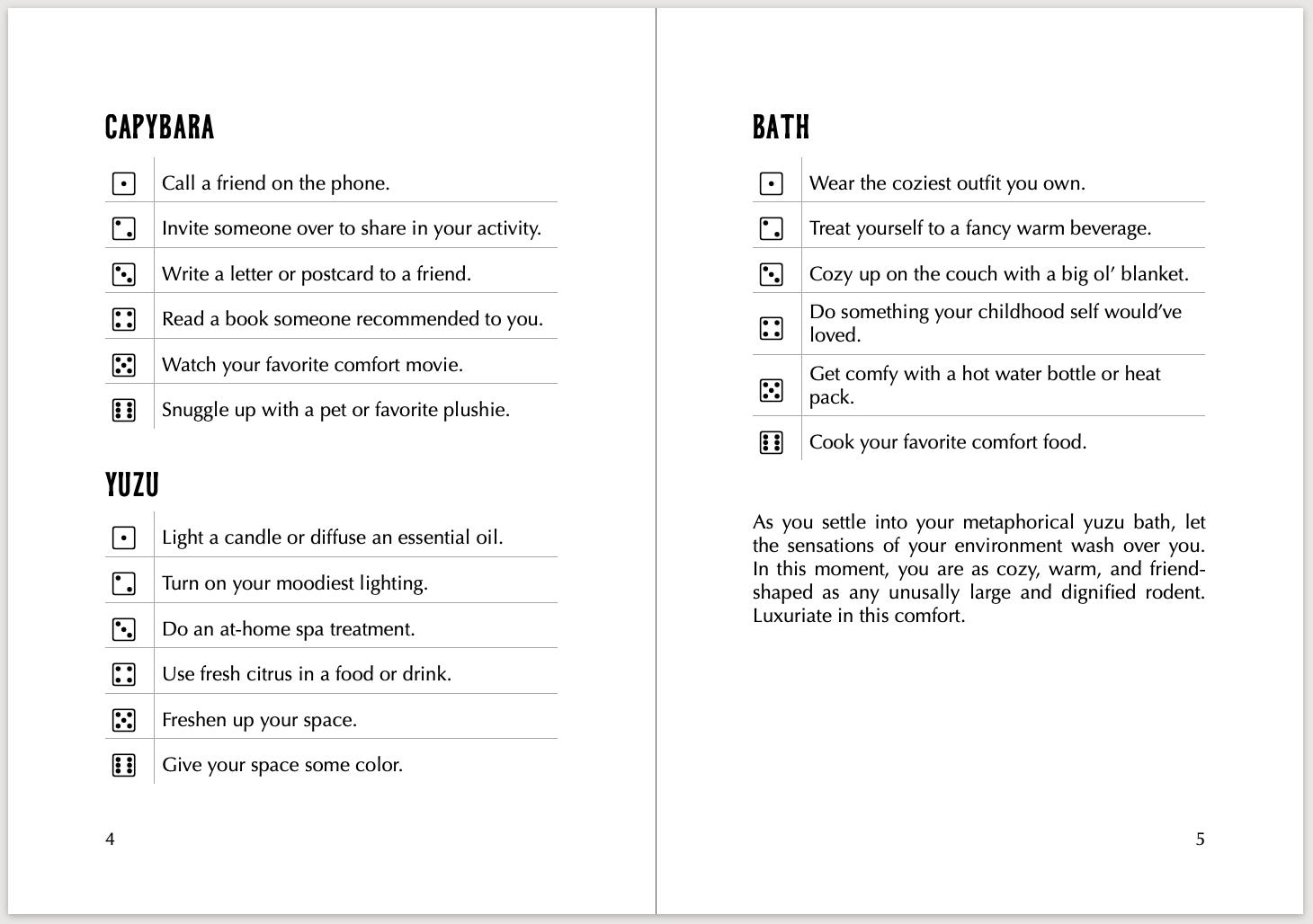
I love how this looks: simple, readable, and focused on the writing. Plus, Larkspur is going to be the first book-length game I print, and less artwork will make printing much more affordable and less complicated!
I do want to have one piece of art for the collection, so I’m commissioning a custom cover. I’ve been talking with the artist this week, and I’m so so excited to see some concepts soon.

Thanks for joining me in layout land! Some brief housekeeping: I’m planning to send future letters on the first and third Mondays of the month. I’ll be back soon with a new essay & more news!
